Equipment buyers trust convention.
Clinic owners signing five-figure orders read clinical-classic as safe. The identity stays inside that convention and earns its difference through craft, not novelty.
EveryDent sells dental equipment to clinic owners across Egypt and the region. We built the identity it trades under — logo and build film, a bilingual English-Arabic system, social launch templates and print collateral.
EveryDent sells five-figure equipment to clinic owners across Egypt and the region. The brand had to read as a serious supplier — and hold that register on every surface a buyer meets.
Clinic owners signing five-figure orders read clinical-classic as safe. The identity stays inside that convention and earns its difference through craft, not novelty.
EveryDent's buyers work in English and Arabic side by side. The system — including the process documentation — was built bilingual from the start.
A supplier's brand gets judged on paper. The eight-step design process was documented and shipped as a deliverable the client can put in front of a procurement team.

Research, sketches, refinement, final mark — each step documented in English and Arabic. The panel shipped to the client as a deliverable in its own right.
Medical blue carries the institutional weight, clinical teal lifts the product names, white keeps the spec material readable.
One sans family carries the whole brand. Hierarchy moves through weight and capitalisation, not a second typeface, so the mark survives any printer or screen.
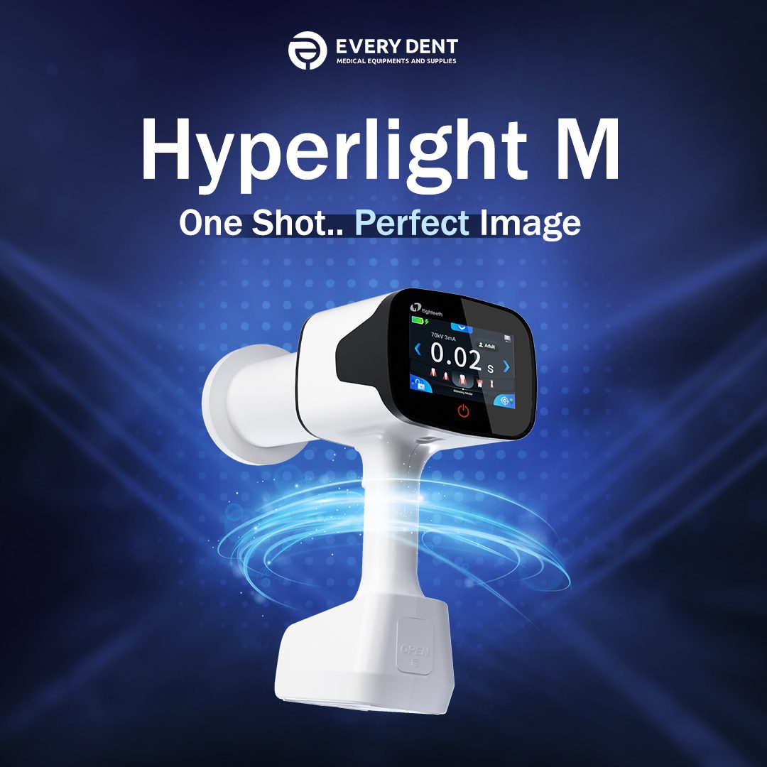

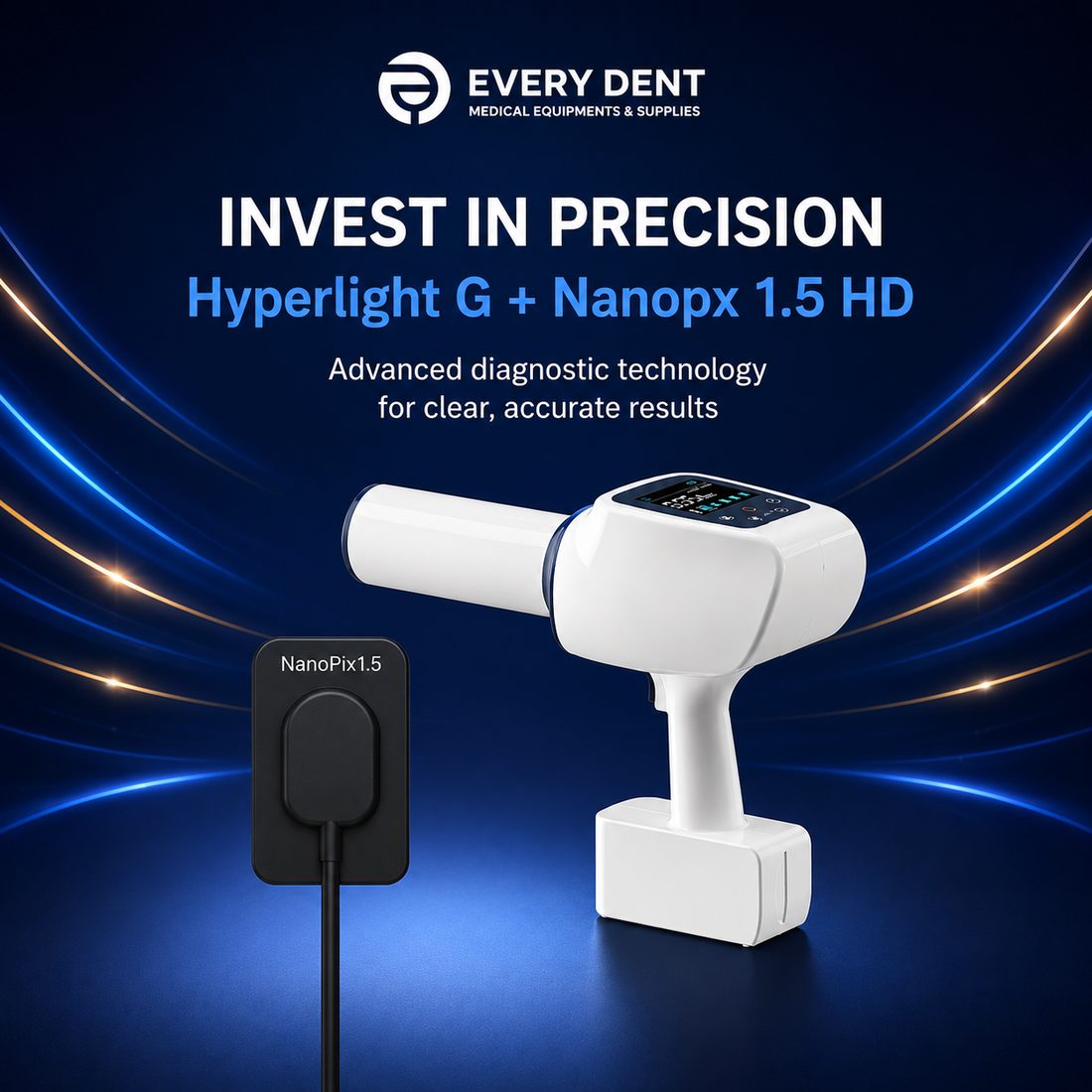
Launch templates for products like the Hyperlight M — product photography leads, the brand frames it, in the posting rhythm a supplier needs.
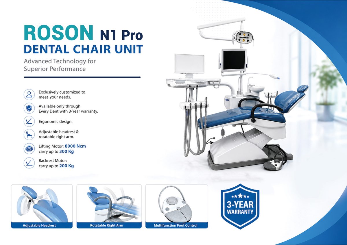


Sales brochures — including the ROSON N1 Pro chair — roll-up banners, flyers and business cards, all on the same wordmark hierarchy and spec-grade typography.
The scope, delivered. EveryDent trades under this identity across its sales surfaces today.
Brand & graphic design is a standing Digilayers service — identity, print and ad creative, built the same way.
Tell us about your business. We reply within 24 hours.